
You may have seen or heard about photographers comparing prints from different labs, and someday I keep meaning to do a formal project like that. In the meantime, I did a little experiment just to see for myself the differences.
I use the Project Life system for scrapbooking personal photos (I will be doing a separate post on that in the future!). I don’t have a quality photo printer at home, and I generally get prints every month or so–anywhere from 70-100 of them. Up to now, I’ve been using the local Walgreens. GASP. I know. But it’s cheap and really fast and I thought the photos were okay. Recently, though, I noticed the photos looked bad. The colors looked off, and everything was oversharpened, which makes the photos look kind of gross. (Sharpening appropriately is fantastic, and I do that, along with other post-processing preparation, for all client prints. That makes the photo look its best. But oversharpening just looks so bad!)
Last month I decided to test it out and see what the same photos would look like from Mpix.com, one of consumer print labs that I recommend to clients who purchase digital images. So I ordered many of the same photos from Walgreen’s and Mpix. They are mostly unretouched/unedited, and some are from my DSLR and some are from my iPhone. Mpix has two options for 4×6 prints, and I ordered all of them on Economy E-surface paper. I also did a few on their ‘regular’ Economy photo paper, but the prints looked and felt the same to me. (I thought I’d asked for color correction, but apparently not. It may have an extra cost associated with it.)
Another thing is that the Walgreen prints are glossy, and the Mpix are not–they’re sort of luster. The prints feel thicker, more substantial and a lot nicer.
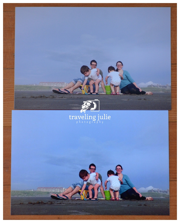
Now, I’ve seen several posts from other photographers comparing pictures, and still, I was SHOCKED. The difference in many photos was staggering! I picked out a few for side-by-side comparisons; for all of these, the Mpix is on top, Walgreens is on the bottom. These comparison images were taking in natural light and not edited or post-processed (other than cropping).
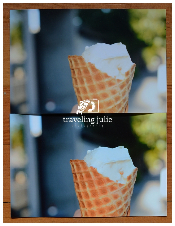
I like my ice cream cones to NOT look radioactive, how about you?
Look at the skin tones–the Walgreens photo has us all looking pink-orange! The Mpix looks like like actual, natural person color.
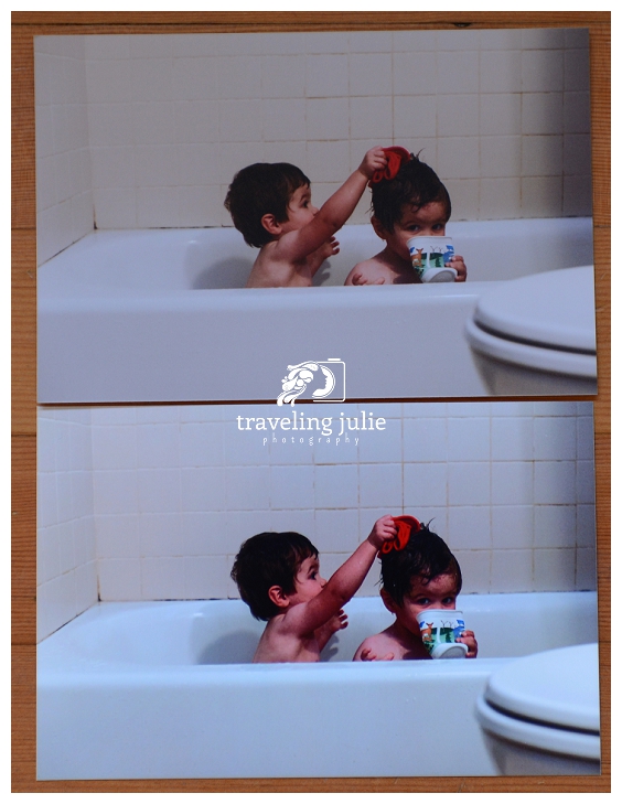
This was a photo I had to lighten in post-processing, and they’re both still dark (our bathroom gets terrible light). But again, look how bright pink-orange the Walgreens is! It does look a little brighter, but the shadows and sharpening look awful.
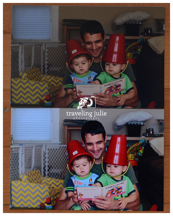
This was a photo taken with my DSLR and a bounced, on-camera speedlight. You can see here how much brighter the Walgreens print is. The color isn’t too awful either, but you can see how much pinker it made my husband look.

These two sets are a little more subtle, but once again, the skin tones tell the story. The Mpix images have a normal and natural skintone to them, and the Walgreens images look a little blue. (For the record, my family is neither blue nor orange in real life! :D)

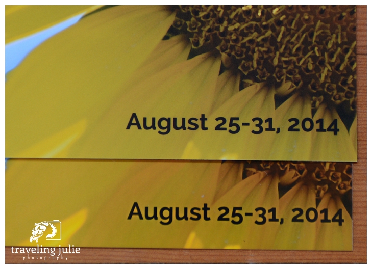
Here you can see the oversharpening in effect, around the text, and also on the petals. Blech.

This was taken in beautiful golden light, and the Mpix keeps the colors correct while also keeping that lovely glow. Walgreens just turns my twins orange!
***
So, friends, when you purchase any digital images as part of your portrait package, I always include a note about recommended labs for printing…and this is why!
I have learned my lesson, and will no longer be printing my personal photos with a cheap lab! The slight extra cost and longer wait time is definitely worth the higher quality!